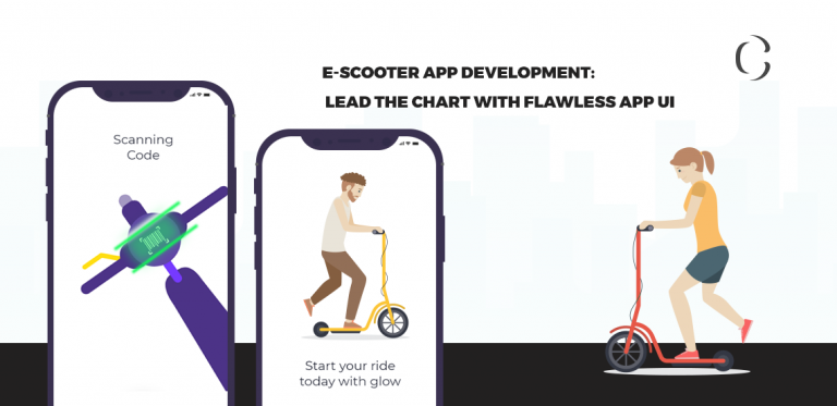
E-scooter app development: Lead the chart with flawless E Scooter app UI
Bird had been a sole player in the micro-mobility market. But inch by inch, many Bird-like companies had intensified the most profitable market. That resulted in innovation. Currently, the robust e-scooter software and reliable e-scooter hardware we are experiencing are the upshots of cutthroat competition.
Companies have been working actively to push the boundaries of the e-scooter rental business by eliminating the conventional features of the app and replacing it with more useful and easy-to-use features in very well designed app screens. In fact, feature set and UI of the e-scooter rental app have witnessed the most number of innovative changes as users opt for only those apps which help them to complete the tasks in a very hassle-free way with well-designed UI and hand-picked features.
Sensing the urgency, we have covered the graveness of e-scooter app design and ways to achieve the very interactive app design, in this blog.
The problems with e-scooter app UI, OR, The graveness of e-scooter app UI
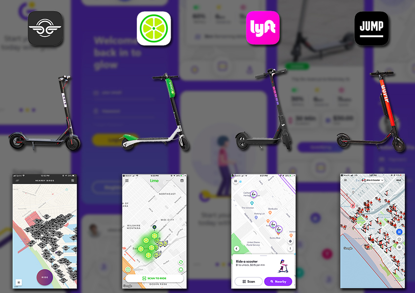
For any app, the UI plays a vitally important role to acquire the users and keep the user engagement rate high. App UI supports app features. If your app is equipped with some of the very rare features but bad UI, you can never attract a good number of users.
Talking specifically about the e-scooter app, the scenario remains the same. A well-designed e-scooter app helps riders to find the ride, book the ride and make a payment without scratching their heads.
However, almost all e-scooter rental apps lack many in-app features and suitable screen designs that make using those features tricky. These apps, their features, and design, all combined, generally fail to answer a few most frustrating questions of users; How do I find an e-scooter on the crowded map? Can I reserve this e-scooter? Will my e-scooter battery last until my destination?
In such cases, it is very obvious that users won’t spend their valuable time to find the answers to these questions. What they generally do is ‘uninstalling’!
A most effective way to solve problems associated with e-scooter app UI
From the last few paragraphs, you may have figured out that the problems associated with e-scooter app UI are lack of informative screens and interactive user experience. So, designing the app in that way can solve problems associated with e-scooter app UI. This is a very straightforward approach with less efficiency. To increase efficiency, you can divide the user groups and find what are the major problems each of these user groups is facing. For instance,
A first user group is a group of people who all want to travel together. Their major frustrations are,
- Unable to locate a group of e-scooters
- Unable to reserve e-scooters for all of them
- E-scooters with different range when they all have the same destination
The second user group contains those users whose underlying purpose of using e-scooters is saving traveling time and cost. Their major frustrations are,
- Unable to reserve e-scooter prior to need (to save time)
- Lack of e-scooters in their nearby areas
- No live fare calculator
The third and last user group is commuters who just want to reach their destinations on time.
- Lack of range estimator
- Unable to quickly find the e-scooter
- Unable to reserve e-scooter prior to the need
So, now when you know the problems associated with e-scooter app UI and how to solve them (which led us to the major frustrations of three user groups), let’s wrap our minds around top app features and app design practices that can eliminate those frustrations and avail you to get sight of ever-increasing user satisfaction and app installment rate.
How should a well-designed e-scooter app look like? What Coruscate can deliver?
If we sum up the frustrations of all user groups, we can get to know the major 4 frustrations that need to be eliminated. These are,
- Nearest e-scooter discovery
- Identifying a single e-scooter in group
- Battery range
- E-scooter pre-booking
To get the solutions to these problems, we have shared a few words with our design team and they suggested us some revolutionary app design tricks.
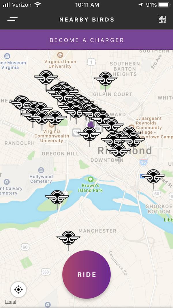
Starting with the first UI problem which is the nearest e-scooter discovery. In the previous version of the Bird’s app, our team has noticed that an overcrowded map filled with overlapping logos makes nearest e-scooter discovery and e-scooter selecting process very tedious for users.
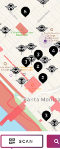
Instead, opt for a cleaner screen as shown in the following image. Here, you can clearly see that manageable Bird Nests look pleasant and can make an e-scooter discovery and selecting process as easy as pie. By clicking on the number icon, the map zooms in and shows the exact location of the e-scooters of that nest.
Once the user discovers the nearest e-scooter on the map, the next problem is being able to locate the e-scooter. For that, our UI team has suggested two mobile app UI changes. First is the image of the last known parked location and the second is the approximate address of the e-scooter.
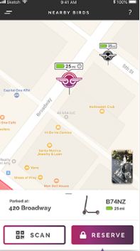
Users always want to know the remaining range of the e-scooters to reach the destination on time. In other words, they want to know will a battery lasts until their destination? To address this issue, you can simply show the battery percentage icon on each e-scooter icon on the map. And if you wish to add some futuristic feature, ask e-scooter app development company to integrate a feature which asks destination from users, and after analyzing watts needed to reach there, it only shows e-scooters with enough battery power.
And the last problem associated with the UI of the e-scooter app is e-scooter reserving. This is a very severe problem as it affects customer satisfaction rate to a large extent. Here is how: A user finds an e-scooter half kilometer away from him. He walks there. But by the time he reaches there, another user occupies it. So, to make sure a user always gets what he wants, the e-scooter reserving feature is the key. It lets users book the e-scooter up to 30 minutes. And when he reaches near the booked e-scooter, he can simply unlock it. Here it is worth mentioning that during the time period of 30 minutes, any other user cannot unlock that booked e-scooter and a user who has booked that e-scooter cannot unlock any other e-scooter!
How much does it cost to develop an e-scooter app with flawless app UI?
Coruscate is the top e-scooter app development company that has entertained numerous amount of e-scooter app development related queries. We accommodate a few highly skilled designers and developers who are clever enough to develop the e-scooter app by considering user behavior and current UI trends. We do not only develop an e-scooter app but assist you throughout your business journey. You can host the IT infrastructure of your e-scooter rental business on our servers for free of cost. You can even seek our help to get government approval and select an e-scooter fleet.
With our rapid app development technique, we can develop your app within 45-55 business days and under $10k.
To know more about features and ask for an e-scooter app demo with a free consultation, contact our business experts and app scientists.
